I was tasked with creating a logo that encapsulated the company's values and products in a visually impactful and memorable way.
I approached the project with the goal of creating a logo that depicted the cyclical nature of fuel and water reuse, which is at the core of Pro DEF Solutions' mission. Through a process of research, conceptualization, and iteration, I ultimately arrived at a final design that effectively communicates the company's message while also being visually engaging and memorable. I am proud of the final product and believe it was a great representation of Pro DEF Solutions' values and products.
Pro def solutions and fuels
DEFINITION:
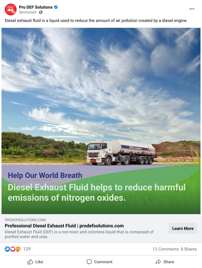
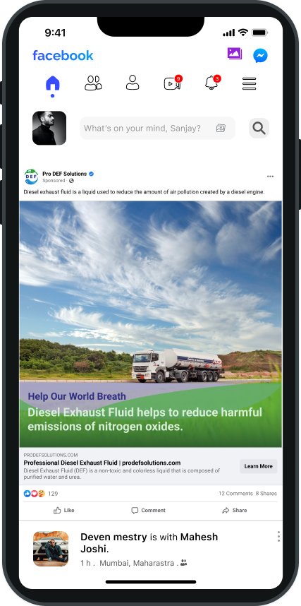
Diesel exhaust fluid is a liquid used to reduce the amount of air pollution created by a diesel engine.

One of the challenges I faced in this project was the lack of existing company branding or a website for reference. The client, Pro DEF Solutions, had not yet established a visual identity for their company, and my task was to create a logo from scratch. Despite the lack of direction, I saw this as an opportunity to be creative and come up with a logo that truly represented the company's values and products.
With a lack of existing information or branding. I started researching related industries, such as petroleum and diesel companies, as well as biofuel companies. By studying these industries, I learnt about common visual elements and design trends used in those fields, and used that information to inform my own designs.
Additionally, studying the logos and branding of these companies gave me an idea of what works and what doesn't, and helped me to identify the elements that are most effective in communicating a company's values and products.
It's also important to research the company's target audience and the specific market I was designing for, it will gave me an idea of the design elements that are most likely to resonate with that audience and be effective in communicating the company's message.


Starting with basic organic shapes that represent nature and the cycle of water was a great way to begin. It allowed me to experiment with different forms and shapes that are associated with the themes of recycling and reutilization.
Playing with the representation of fuel was also a good idea, as it helped me to communicate the company's products in a visual way.
#3AAA35
Colours
Green stands for balance, nature, spring, and rebirth. It's the symbol of prosperity, freshness, and progress. We see green the most in nature. From lush green landscapes to parks and your garden.
#2D2E83
Colours
Blue stands for loyalty, honesty, trust, responsibility, calm, commitment, wisdom, and serenity. These are all good traits that the company wanted to convey.
The darker shade of blue also has a more corporate feel.
Incorporating these elements into the design helped me to create a visual metaphor that effectively communicates the company's mission and values. It's was also important to consider how these elements were integrated into the overall design, such as the placement and scale of the elements in relation to the text.
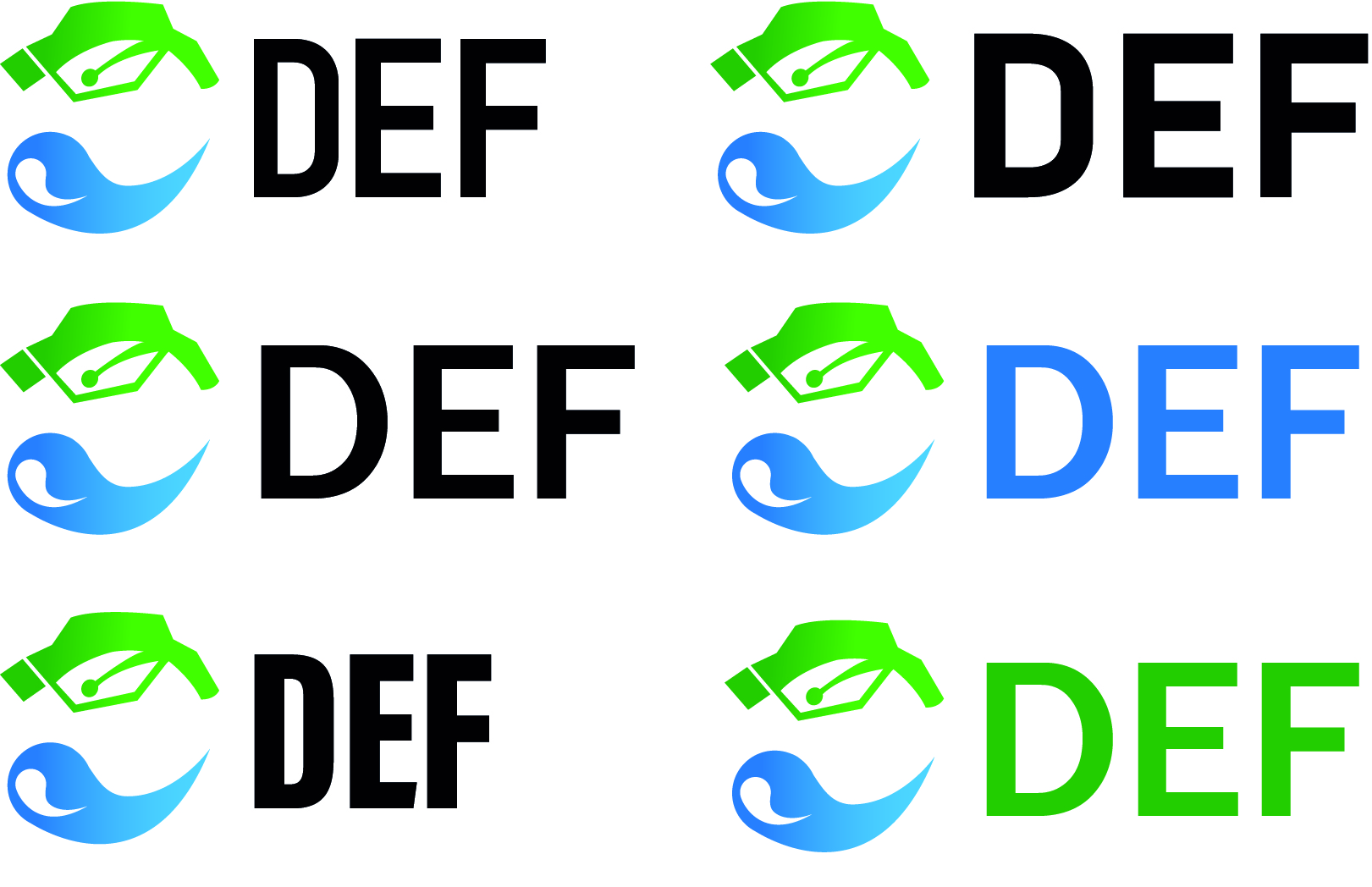
The name of the typeface is Evander.
It is dynamic and subtle, with a clean and modern look that can help to create a sense of motion and energy. The font is easy to read, which is very important in a logo design as it ensures that the name of the company is legible and easy to understand. Also the font being recognisable is also important, as it will help to create a sense of brand recognition and association.

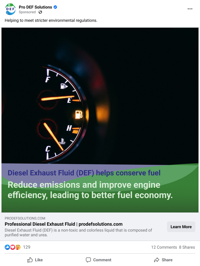
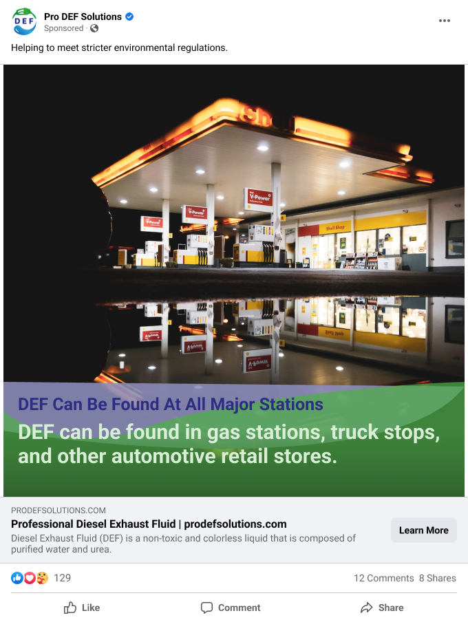
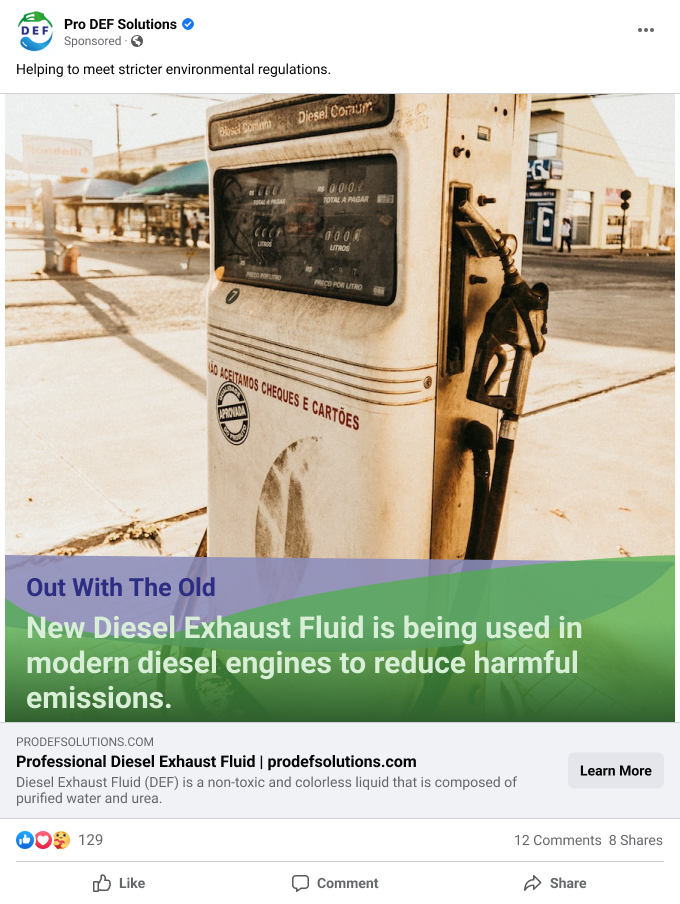
I created eye-catching visuals and compelling ad copy highlighting the environmental benefits and fuel savings of using DEF, and targeted the ads towards trucking and fleet management industries through various social media platforms.
Conclusion
In conclusion, the design process for Pro DEF Solutions' logo involved a thorough understanding of the company's mission, values, and products. The aim was to create a logo that effectively communicated the company's message while also being visually engaging and memorable. The research, sketching and conceptualization phase allowed for a diverse range of ideas to be generated and refined, which ultimately led to the creation of a final design that effectively communicates the company's message and values. The use of a pump and droplet as visual representation of the company's products, and the font Evander helped to create a cohesive and visually appealing logo that is easy to read and recognise. Overall, the final logo design effectively represents Pro DEF Solutions.
