DōJō
DEFINITION:
Dojo is a Japanese term literally meaning
a ‘place’ where the ‘Way’ is taught.
What is the Way? Essentially it is the process of learning how to make the most of our potential and lead a balanced and joyful life.

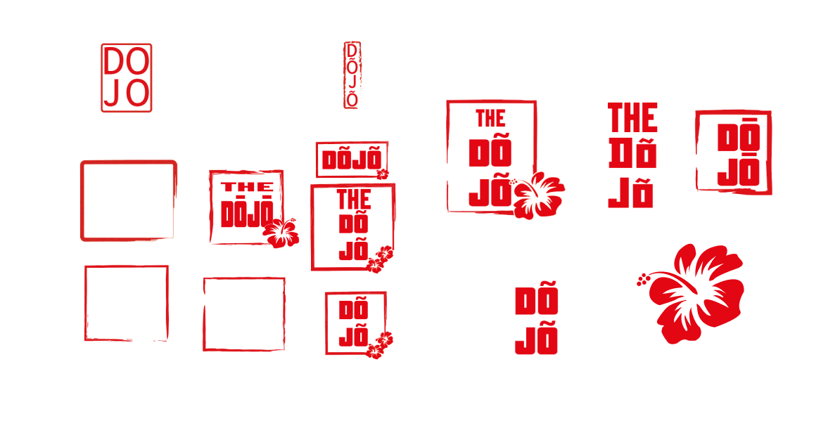
The client requested a logo design that seamlessly blends the imagery of the Japanese hibiscus flower with the traditional aesthetic of a Japanese chop or artist seal. The flower symbolizes the client's connection to Japan and represents concepts of growth and health. The final design should effectively convey these elements while also adhering to the client's guidelines.
Time to do research. What is a chop? In Japan and other East Asian countries, a "chop" or "hanko" is a small, hand-carved stamp that is used to sign documents and other materials. It is considered a more formal and official way of marking something as having been authorized or approved, and is commonly used in business and legal contexts. The design of the chop is often personal and unique, and can include the person's name or a symbol that is meaningful to them.


Starting with basic shapes will give me a foundation to build on, and referencing traditional Japanese stamps can help me understand the aesthetic and design elements that are commonly used in that style. From there, I can experiment with different design options, incorporating the hibiscus flower imagery, and finding the right balance between the traditional and personal elements.
#E8272D
Colour
Red has many symbolic meanings through many different cultures including life, health, vigour, war, courage, anger, love and religious fervour.
The colour red is very popular in Japan. Many shrines and temples are red and this fact has a very ancient meaning. The colour red was seen as a way to scare away evil spirits. The symbolic meaning of red is peace and prosperity in the family.
#fffff
Colour
The colour white is often associated with a number of different meanings and symbolic associations.
Positivity and freshness: White is also associated with positive energy, freshness and new beginnings, as is often used to represent a fresh start or a new beginning.
Peace and serenity: White is also associated with peace, tranquillity, and calmness. It is often used to create a soothing and relaxing atmosphere.
Minimalism and simplicity: White is often used as a background color to create a clean and simple design aesthetic. This can be particularly effective for designs that are intended to be modern, minimalist, and uncluttered.
PricedownBl is a bold and striking font that can grab the viewer's attention, which is important for a logo design. Using the macron character above the "O" is also a good idea, as it helps to differentiate the name of the dojo and indicate that it is a proper noun. The use of the macron is also important as it indicates that it is the correct spelling and it is located in Portugal. It is important to pay attention to the small details like this when creating a logo, as it helps to ensure that the final product is accurate and effective in communicating the desired message.

Starting with the shape and border of the stamp set the foundation for the rest of the design. Then, incorporating the text and positioning it within the frame will helped to ensure that it is legible and balanced within the overall design.
Finally, adding the hibiscus flower imagery and positioning it in a way that complements the text and stamp will help to create a cohesive and visually appealing logo.
It's also important to remember that during the digital phase you can test different colour options, different variations and different sizes for the logo. This will help me and the client to have a clear idea of how the logo will look in different contexts
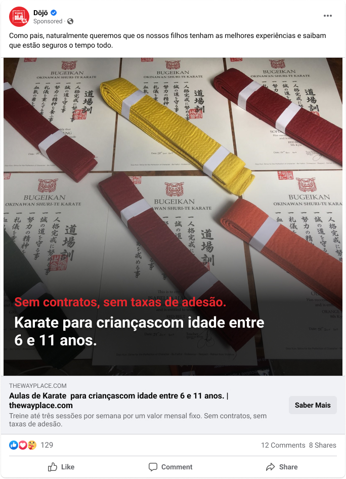

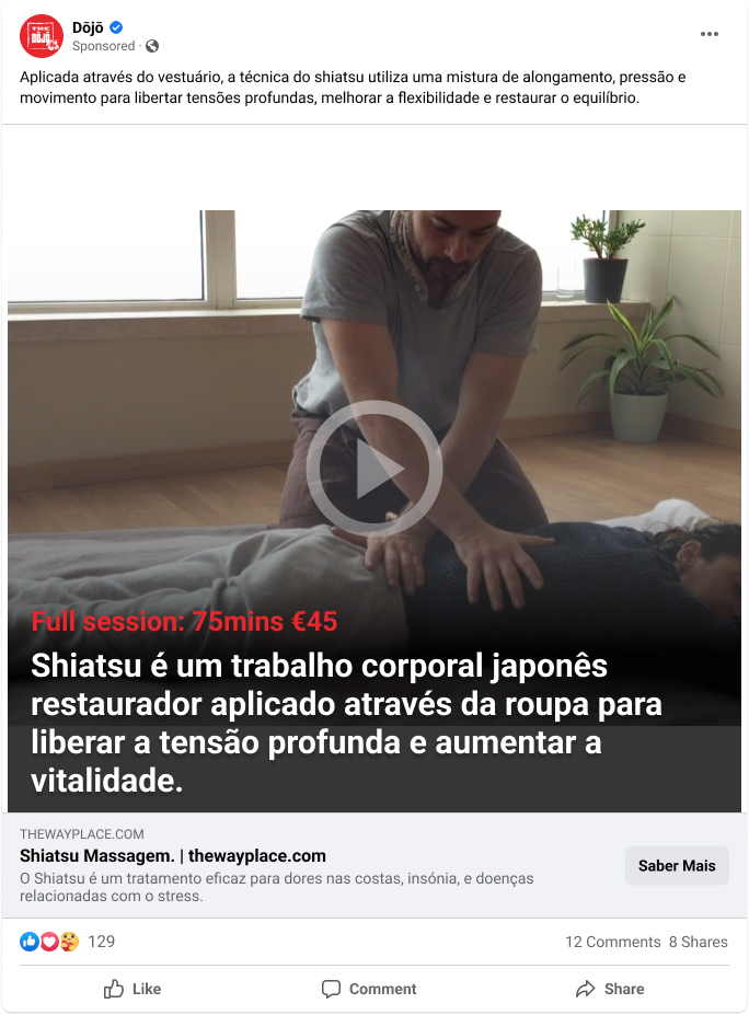

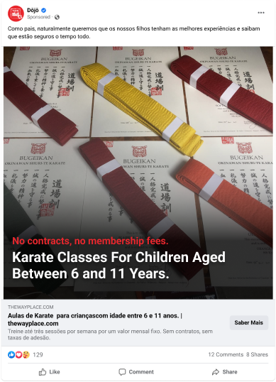
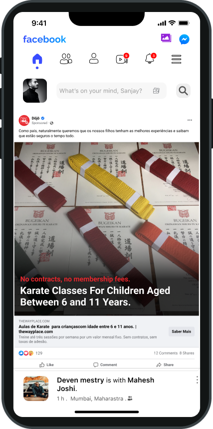

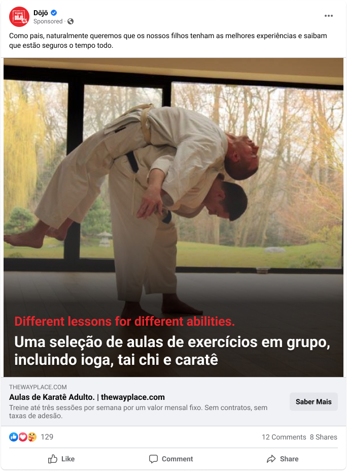
Using a sketch filter to give the logo a rough and ready feel that is both retro and modern. Helped to create a unique and visually interesting logo, and also aligns with the client's request for the logo to have a traditional chop or seal aesthetic.
I also added this filter to make it look like an used chop or seal, it gives the logo more personality and authenticity.
It's important to keep in mind that the final product should still be legible and easy to understand, despite the added texture and it should be easily reproducible in different sizes and on different mediums.